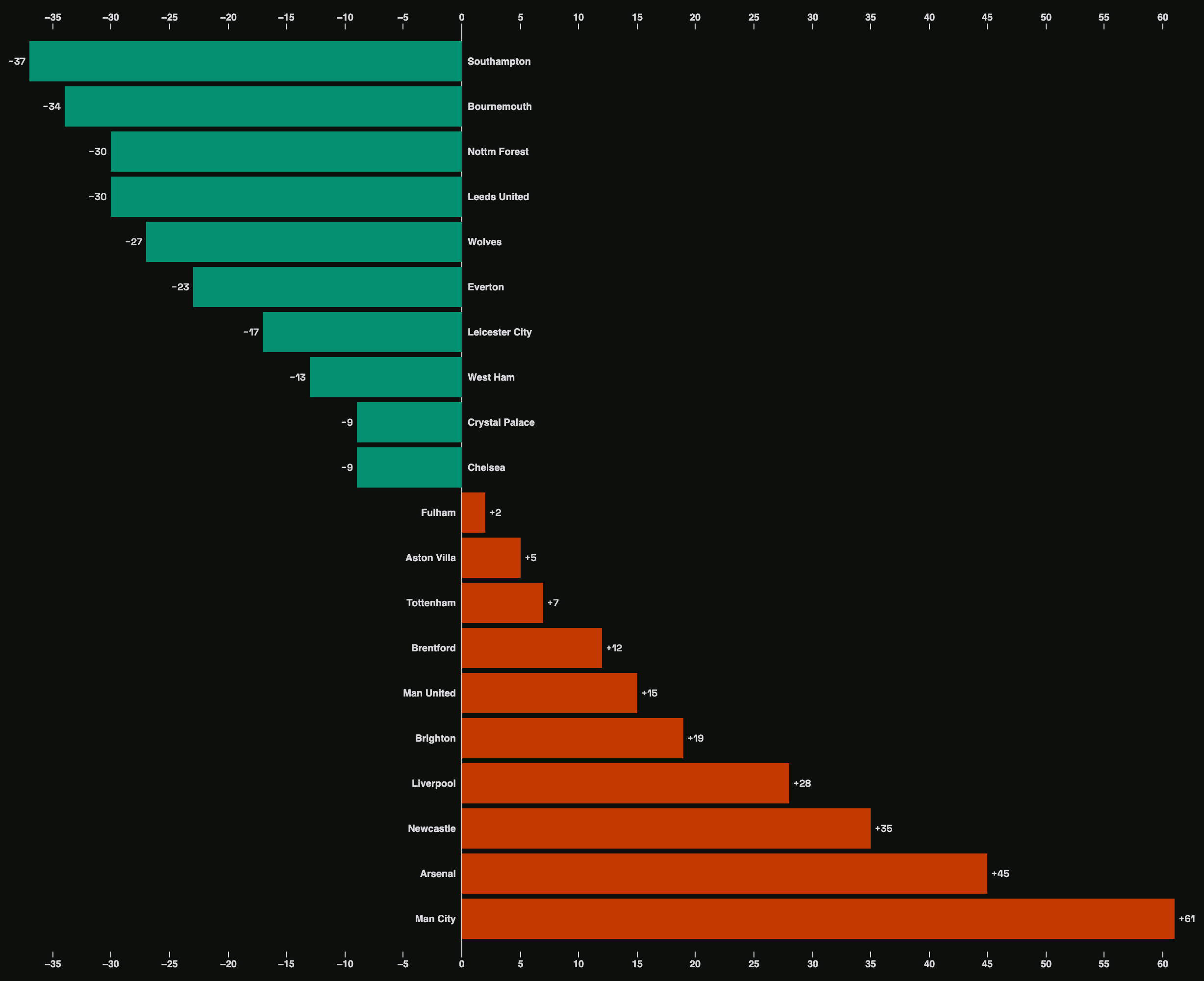
It all started in 2019 when the need for charts (for dashboards) kept recurring in project requirements, so much so that I needed to upskill immediately and fast. I did the usual thing anyone would do: run a Google search. A couple of search results later and several days of learning how to build charts with some JavaScript and React tools, I was acutely sure that I’d found all that I needed. But looking back, that couldn’t be farther from the truth.
The more I learned about charts, the more I found them everywhere—that is the only place I knew to look: dashboards. I developed a postulation that you can’t do without charts in dashboard applications. And so it followed that everything I tried to learn on the topic was tightly coupled to my limited worldview. But like a glimmering pull of becoming, my memory started to serve me well and connect the dots. In Secondary School, I plotted graphs (with scales, grid lines, and axes) in my Physics and Mathematics classes. And I also happened to have once owned an Atlas as a requirement in Geography class. After a stretched period, I was led toward D3 (or D3.js, Data-Driven Documents), “the JavaScript library for bespoke data visualization.” And everything would never be the same again.
Discovering D3.js
I can’t remember exactly where or how I first discovered D3, but I remember everything after. After I read about the rawness and customizability of D3, I took a keen interest in it. I looked into the abyss and partnered with two work buddies to purchase the Fullstack D3 and Data Visualization book. I abandoned the book (alongside charts and D3 altogether) after spending some days on the first few pages. I thought I’d bitten a bit too much until three years later, when, for reasons unknown, the enthusiasm became resurgent.
My New Year’s resolution for 2023 was to learn how to build charts for dashboards. I purchased the companion video course to the book I’d bought three years earlier and planned to spend that January digesting them once and for all. I began to slowly build charts in D3 until I erroneously thought I was ready. After befriending my failure to plot anything meaningful unguided, I started to explore. What is Data Visualization? What is D3? Those were the questions.
I read Michael Bostock, Vadim Ogievetsky, and Jeffrey Heer’s seminal paper D3: Data-Driven Documents, submitted to the IEEE Transactions on Visualization and Computer Graphics in 2011, as the introduction to the concept of Data-Driven Documents twelve years ago. It clarified a lot of the theoretical aspects of D3 for me. Most importantly, I understood the why, what, and how. It was also the provenance of my first foray into Data Visualization as a field. Until then, I hadn’t cared much for the semantics, and I basked in the blissful ignorance of naivety or the complete innocence of a child. This was when the abyss gazed back into me.
How it is going
It’s been about a month and a year since I started learning D3, and even though it has a steep learning curve, I’m enjoying the process. If you’re indecisive about whether you should learn D3 or not, and you read the What is D3 page, the answer I deduce you’d get is “Don’t” or, at best, “Dare.” To quote the documentation: “D3 makes things possible, not necessarily easy; even simple things that should be easy are often not.” And to quote the documentation paraphrasing Amanda Cox: “Use D3 if you think it’s perfectly normal to write a hundred lines of code for a bar chart.” Or, as I like to think fleetingly when the going gets tough: “Use D3 if you’re a masochist.” Or if you enjoy the fascination of what’s difficult.
D3 is raw. To plot with D3 is to gradually compose several standalone or interdependent low-level primitives like scales, axes, shapes, etc. All these require an in-depth understanding of the primitives themselves, the data, and the goal (the visualization). There are high-level chart libraries built on top of D3, but as it has been established, I am a masochist. I just want to write D3 (of course, this is a headstrong decision for myself. When working on a non-personal project, I know where my loyalty belongs.)

I regularly update my D3 journey on Observable, a platform for creating, collaborating, and learning with data, founded by Mike Bostock, the creator of D3, and Melody Meckfessel. I’m currently learning D3 APIs, for example.
I’m standing on the shoulders of giants: I’m currently reading The Visual Display of Quantitative Information by Edward R. Tufte and learning from and building with other community members at Observable and the Data Visualization Society. And I intend to showcase, document, and write more about data visualization on this website—keep an eye out.
On my Observable profile is my bio. It reads: “I came for the knowledge of creating charts for dashboards, but I stayed for the beauty of this craft.”
There you have it.